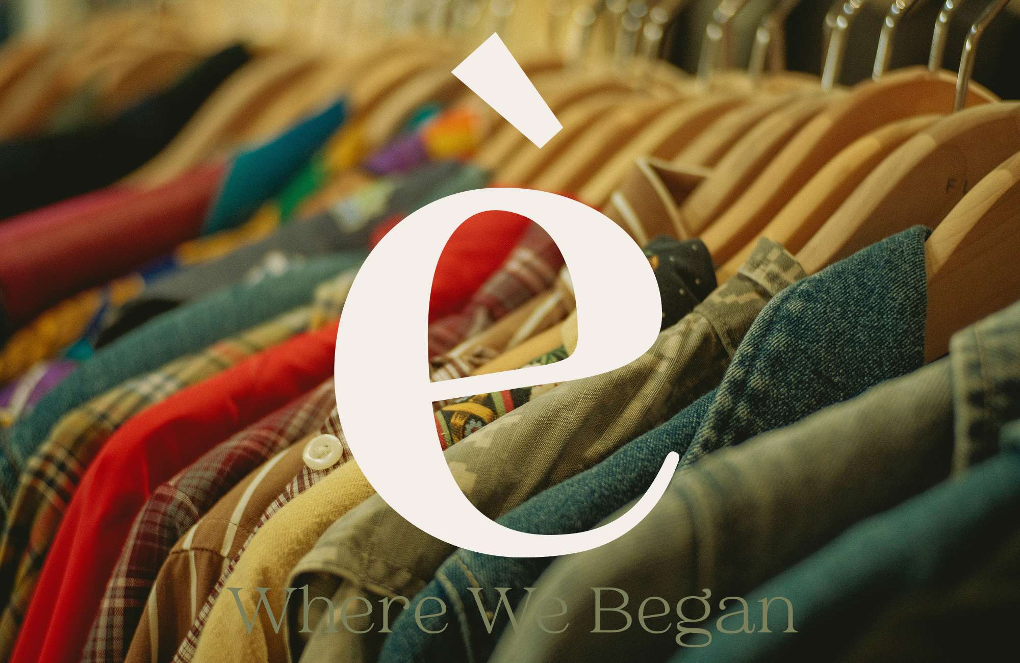
Some brands start with a logo.
genèse started with a feeling.
The feeling of looking back at the places, people, and moments that quietly shaped us. The conversations we still remember. The streets that felt like home. The memories that never really left.
That feeling became the foundation of genèse, a fashion brand built around nostalgia and community.
Before designing anything, we asked a simple question:
What should this brand make people feel?
The answer guided every decision that followed.
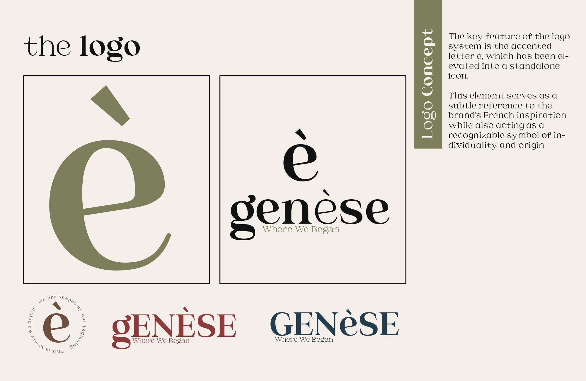
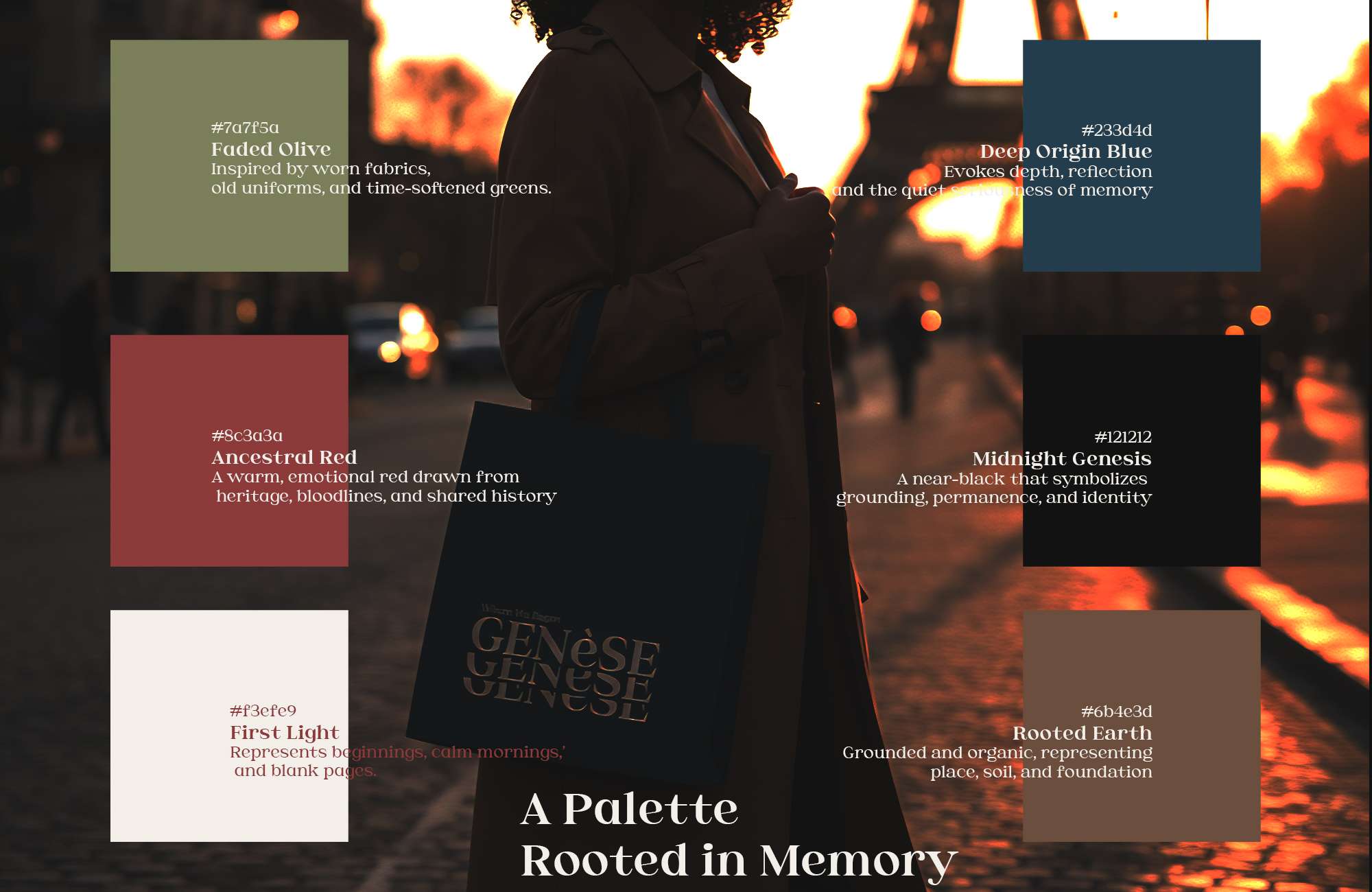
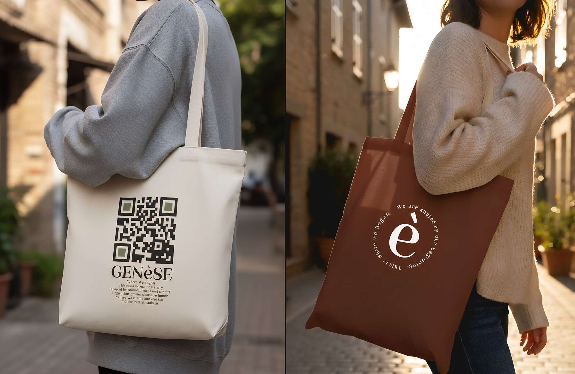
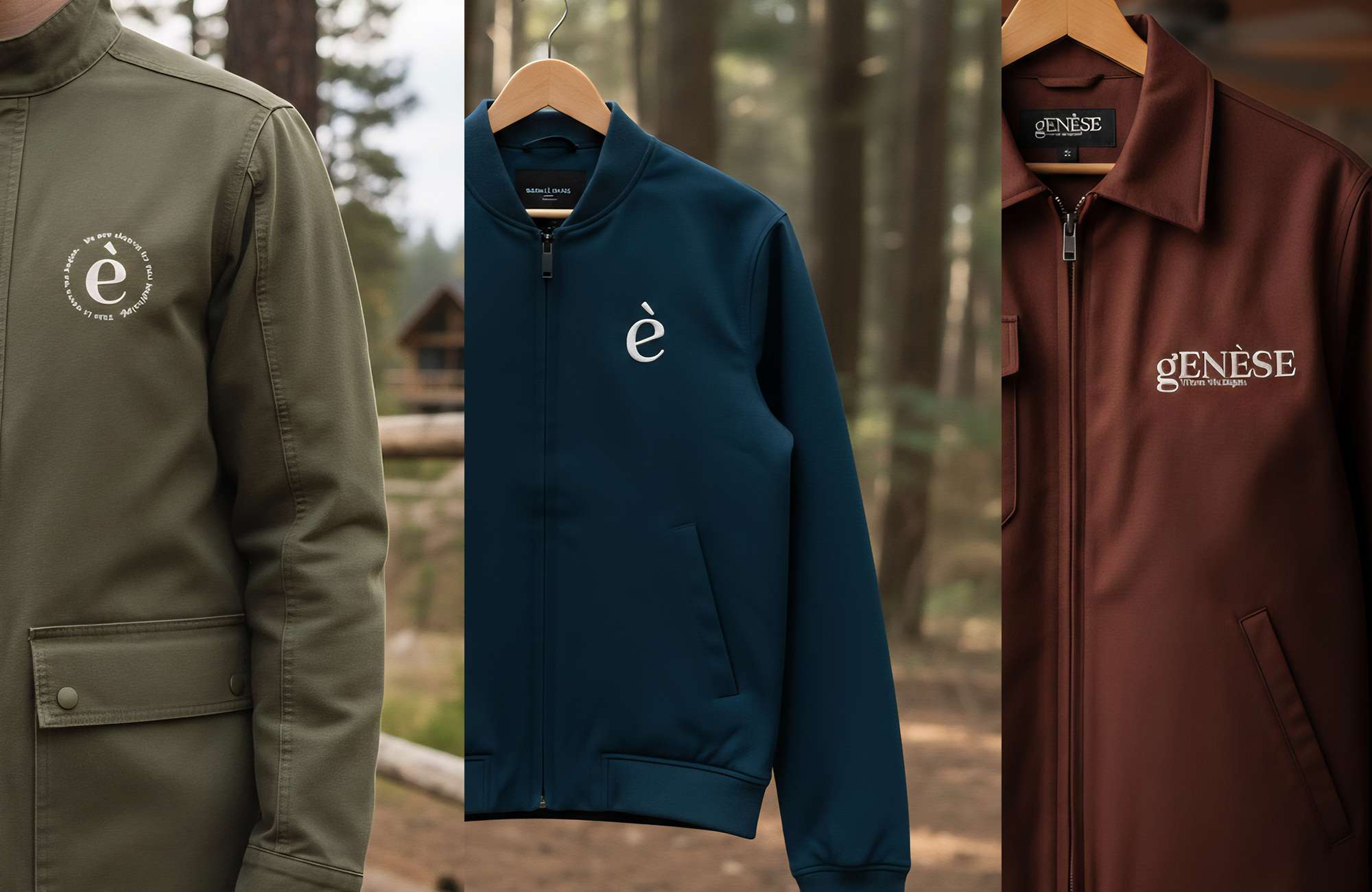
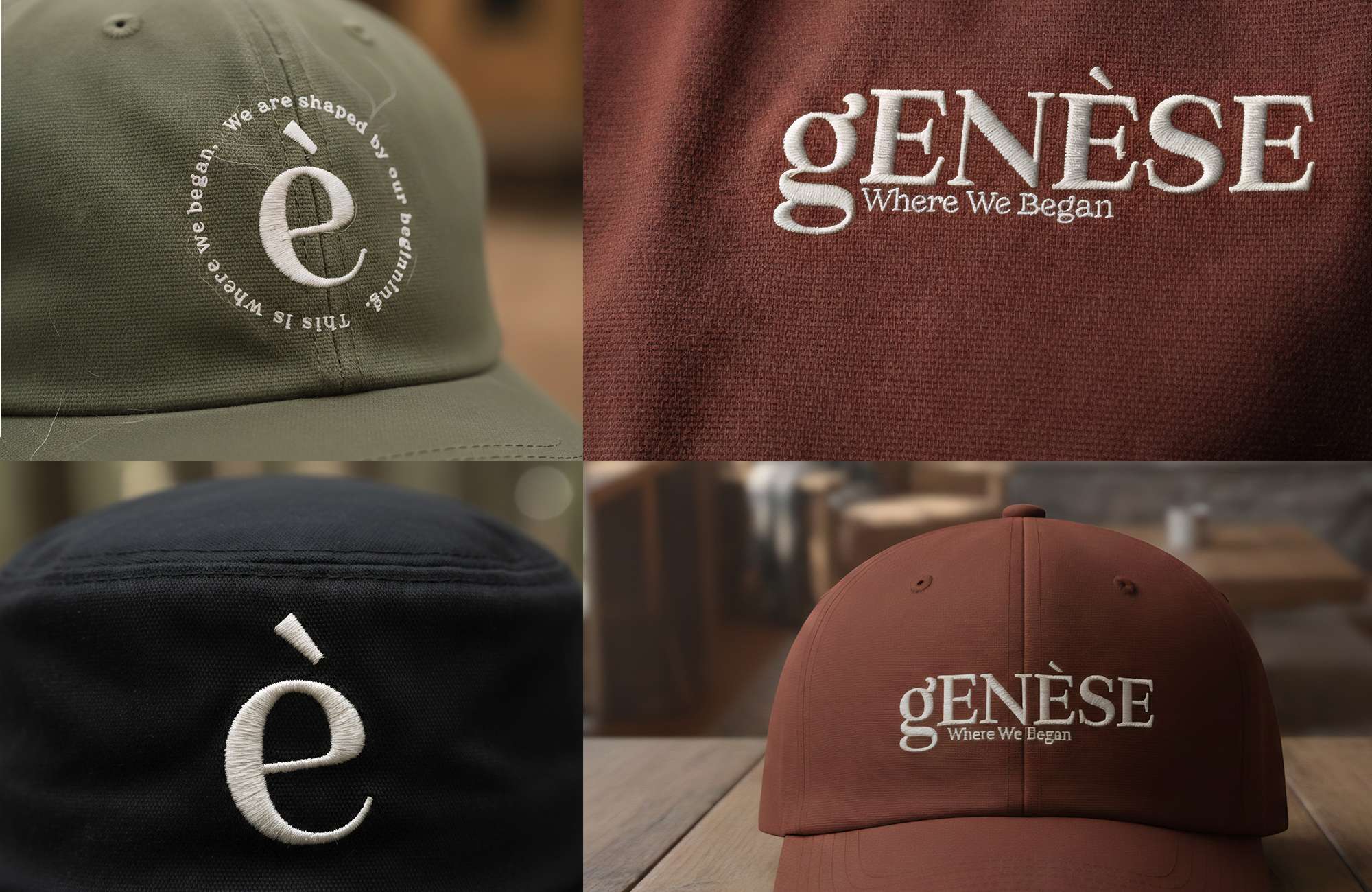
The name, genèse, comes from the French word for "genesis," meaning beginning. It represents our roots, our stories, and the moments that shape who we become. The logo embraces the distinctive **è**, transforming it into a recognizable symbol of identity and origin. A warm, muted color palette inspired by aged paper, earth, worn fabrics, and old photographs reinforces the feeling of familiarity and timelessness.
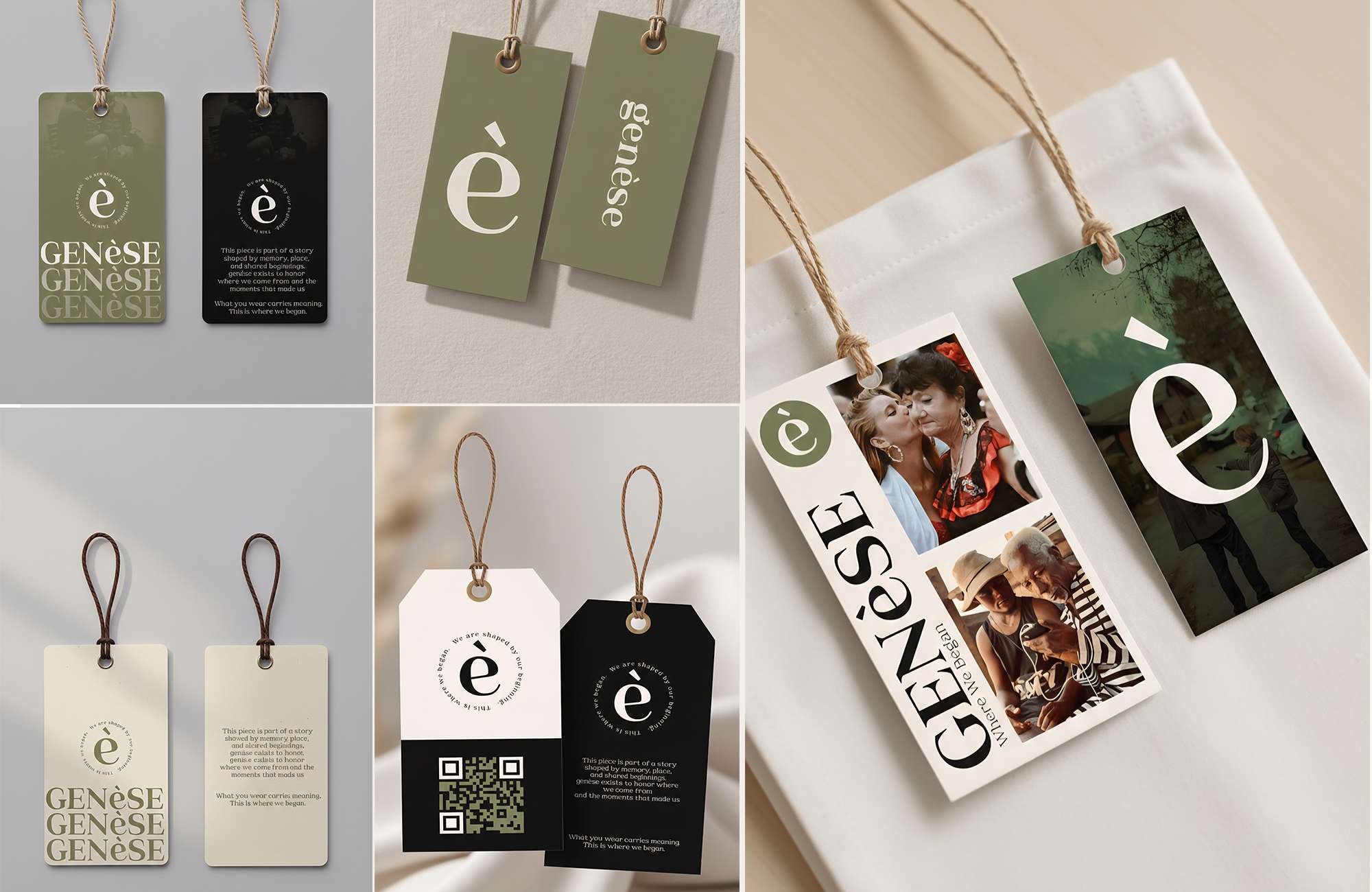
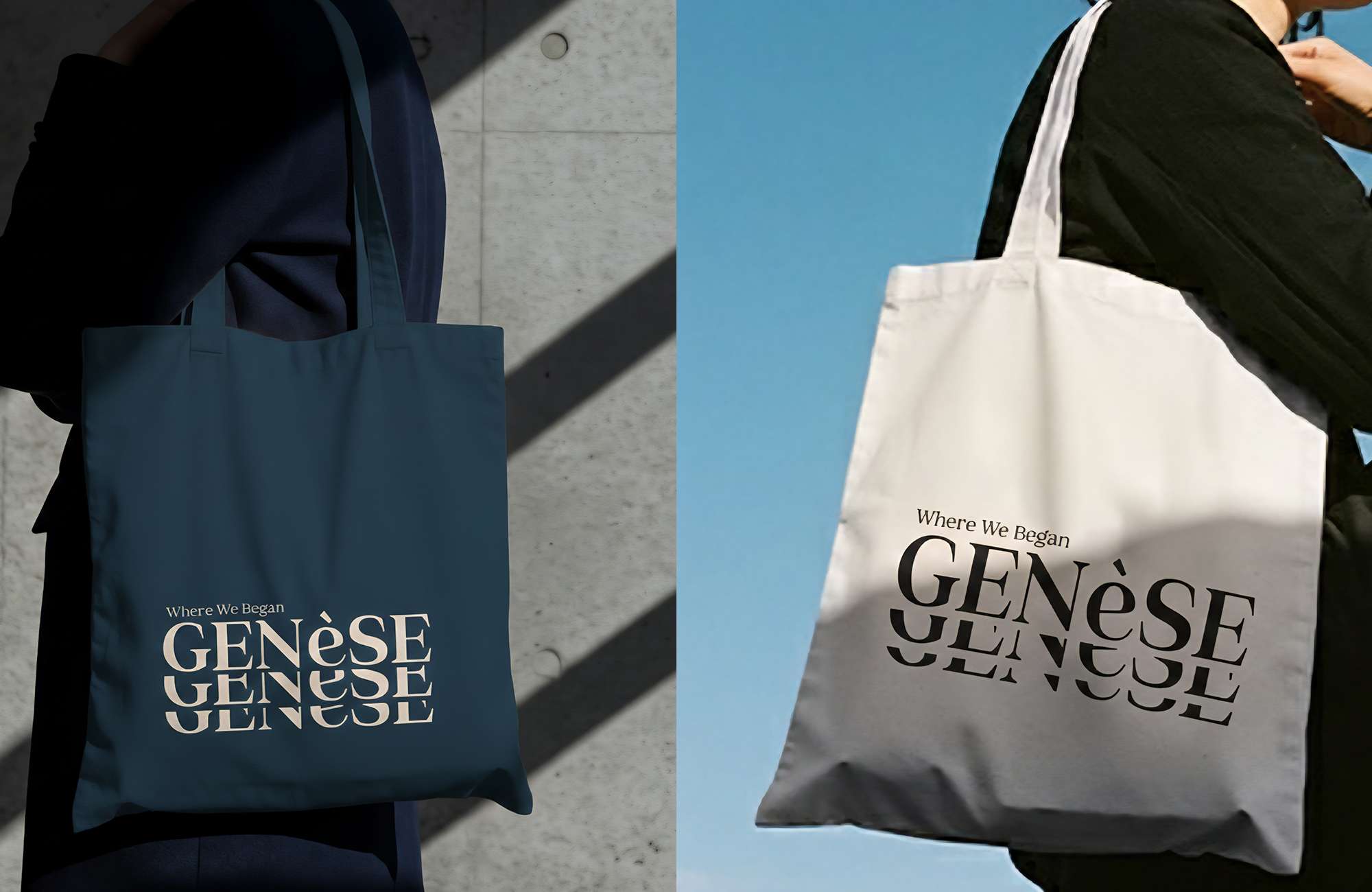
Every touchpoint, from the clothing labels and tote bags to the packaging and visual identity, was designed to tell the same story. Nothing exists simply for decoration. Every detail has a purpose, and every application strengthens the connection between the brand and the people it speaks to.
For us, branding has never been about creating something that simply looks beautiful. It's about creating something people can connect with, remember, and carry with them.
Because the strongest brands don't just tell stories.
They remind us of our own
genèse started with a feeling.
The feeling of looking back at the places, people, and moments that quietly shaped us. The conversations we still remember. The streets that felt like home. The memories that never really left.
That feeling became the foundation of genèse, a fashion brand built around nostalgia and community.
Before designing anything, we asked a simple question:
What should this brand make people feel?
The answer guided every decision that followed.
The name, genèse, comes from the French word for "genesis," meaning beginning. It represents our roots, our stories, and the moments that shape who we become. The logo embraces the distinctive **è**, transforming it into a recognizable symbol of identity and origin. A warm, muted color palette inspired by aged paper, earth, worn fabrics, and old photographs reinforces the feeling of familiarity and timelessness.
Every touchpoint, from the clothing labels and tote bags to the packaging and visual identity, was designed to tell the same story. Nothing exists simply for decoration. Every detail has a purpose, and every application strengthens the connection between the brand and the people it speaks to.
For us, branding has never been about creating something that simply looks beautiful. It's about creating something people can connect with, remember, and carry with them.
Because the strongest brands don't just tell stories.
They remind us of our own
Project Gallery (7)
View Live Project
See the live application, interactive design, and implementation.